
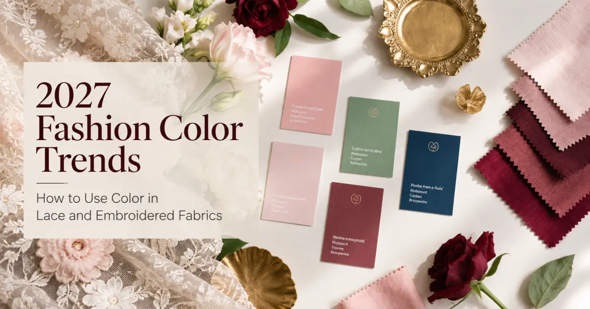

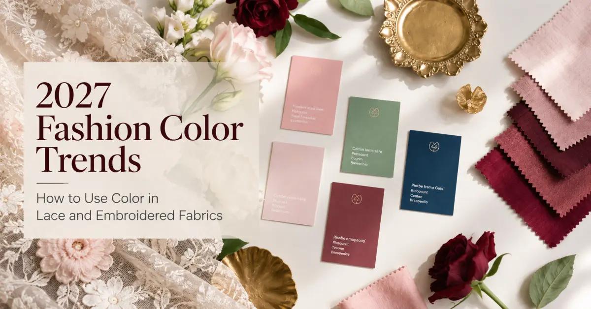
Color can completely change the character of a lace or embroidered fabric. The same floral pattern may look delicate in ivory, contemporary in charcoal, or expressive when developed with several contrasting embroidery threads.
For fashion brands preparing their 2027 collections, color selection is therefore more than a seasonal styling decision. It influences fabric development, garment coordination, sampling, and production consistency.
Rather than relying on a single predicted color of the year, designers can explore several color directions that work across different materials and apparel categories.
This guide examines six color directions worth considering for 2027, explains how color behaves differently in lace and embroidery, and provides practical advice for developing production-ready fabrics.
Six Color Directions to Explore for 2027
The following palettes are proposed design directions for collection planning, not an official ranking of 2027 fashion colors.
Soft Neutrals: Ivory, Oat, Sand and Warm Gray
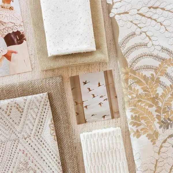
Neutral colors provide a flexible foundation for lace and embroidered fabric collections.
Ivory, oatmeal, soft beige, sand, and warm gray can highlight textile texture without competing with intricate patterns.
In lace fabrics, these shades often create a subtle relationship between the decorative threads and the base material. In embroidered fabrics, they can emphasize stitch direction, raised surfaces, and tonal differences.
Suitable applications:
-
Lightweight summer blouses
-
Relaxed dresses and coordinated sets
-
Minimalist fashion collections
-
Tonal embroidered panels
-
Lace trims for everyday apparel
A useful approach is to combine several nearby neutral shades rather than using exactly the same color throughout the garment.
For example, warm ivory embroidery on a sand-colored base can create visible depth while maintaining a restrained appearance.
Development consideration: Light neutral fabrics may reveal differences in thread shade, base fabric whiteness, and finishing more easily than expected. Buyers should approve the complete fabric sample rather than relying only on a thread color reference.
Muted Botanical Colors: Sage, Olive and Dusty Green
Green-inspired palettes can give floral embroidery and decorative lace a natural, understated character.
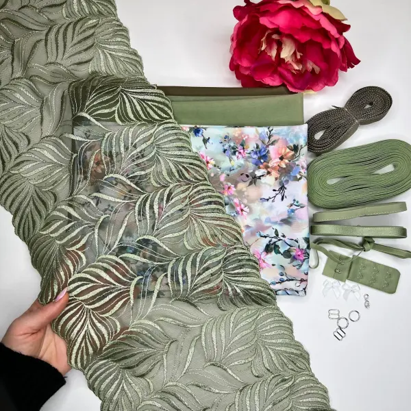
Instead of highly saturated greens, brands can explore muted sage, gray-green, olive, and softened moss tones.
These shades are particularly effective when combined with botanical motifs or natural-looking base materials.
Suitable applications:
-
Resortwear
-
Casual dresses
-
Decorative blouse panels
-
Nature-inspired embroidery
-
Cotton-based fashion collections
For embroidered fabrics, different green shades can be used within the same motif to create leaves, stems, and layered botanical details.
For lace, a single muted green can give a familiar floral pattern a different identity without changing its construction.
Development consideration: Green shades may appear warmer or cooler depending on the base fabric and lighting. Physical color approval is important when coordinating multiple garment materials.
Powdered Pastels: Dusty Pink, Lavender and Mist Blue
Pastels can be interpreted in a more sophisticated way by reducing saturation and introducing subtle gray undertones.
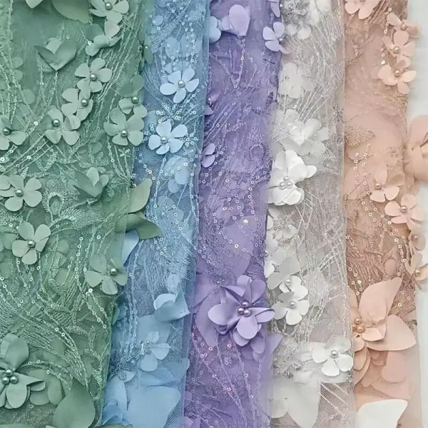
Dusty rose, pale lavender, mist blue, and muted peach offer opportunities for delicate color combinations without creating an overly bright appearance.
These shades can work particularly well with fine floral embroidery and lightweight transparent materials.
Suitable applications:
-
Feminine blouses
-
Occasionwear
-
Lightweight dresses
-
Decorative sleeves
One possible combination is a pale blue base fabric with ivory and lavender embroidery.
Another is dusty pink lace layered over a deeper tonal lining to make the lace pattern more visible.
Development consideration: Pastel shades can be sensitive to small color variations. Sampling should account for the appearance of both the decorative thread and the underlying fabric.
Earthy Warm Colors: Terracotta, Clay and Cocoa
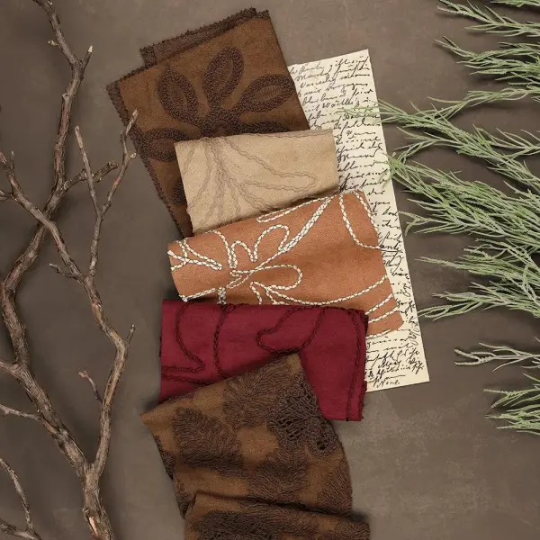
Warm earth tones provide an alternative to conventional light-colored lace.
Terracotta, clay, cinnamon, cocoa, and muted rust can make decorative textiles feel more grounded and expressive.
These colors can also work across seasonal collections depending on the fabric weight and garment silhouette.
Suitable applications:
-
Autumn-inspired dresses
-
Fashion jackets
-
Embroidered skirts
-
Textured decorative panels
-
Coordinated sets
For example, cocoa-colored embroidery on a beige base can create a refined tonal effect, while rust-colored motifs on a cream fabric provide stronger contrast.
In lace, warm brown shades can help transform traditional floral patterns into materials suitable for contemporary casualwear.
Development consideration: When combining warm colors with lighter base fabrics, check whether dyeing, washing, or finishing could affect the intended contrast.
Deep Accent Colors: Burgundy, Midnight Blue and Forest Green
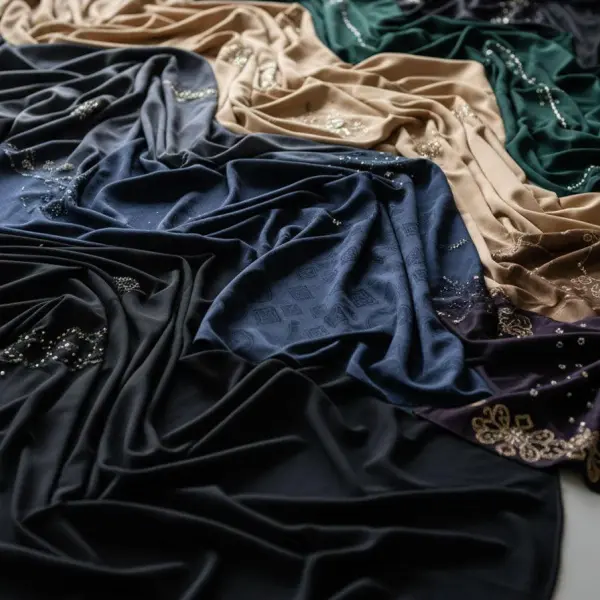
Deep colors can give lace and embroidery a stronger visual presence.
Burgundy, midnight blue, forest green, and dark plum are useful for collections requiring richness without relying exclusively on black.
These shades can emphasize large decorative motifs and create contrast against lighter fabrics.
Suitable applications:
-
Eveningwear
-
Statement dresses
-
Fashion jackets
-
Decorative garment inserts
-
Premium coordinated sets
A deep burgundy lace fabric can become the main feature of a simple dress, while midnight blue embroidery can add texture to a matching dark base.
For brands developing coordinated collections, deep accent colors can also connect several garments through repeated decorative details.
Development consideration: Dark base fabrics and embroidery threads may not reflect light in the same way. A physical sample is needed to confirm whether the pattern remains sufficiently visible.
Controlled Bright Accents: Coral, Cobalt and Vivid Yellow
Bright colors can be effective when used selectively.
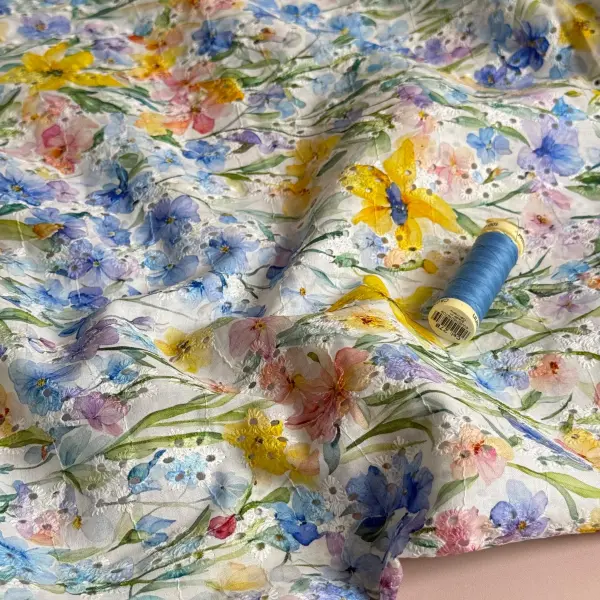
Rather than applying intense color across an entire fabric, designers can introduce small areas of coral, cobalt, or vivid yellow within embroidery patterns.
This approach allows the color to become a focal point without overwhelming the garment.
Suitable applications:
-
Statement embroidery
-
Resortwear accents
-
Decorative shirt panels
-
Contemporary fashion details
-
Limited-edition collections
For example, a mostly neutral floral embroidery design can include a few cobalt petals or coral centers.
The result may be more versatile than an entirely bright-colored embroidered fabric.
Development consideration: Highly saturated colors should be checked for colorfastness and compatibility with adjacent materials, especially when light and dark threads appear together.
How Color Behaves Differently in Lace and Embroidered Fabrics
Although lace and embroidered fabrics can share similar color palettes, they do not always produce the same visual results.
Understanding their construction helps designers select colors more effectively.
Color in Lace Fabric
In many lace constructions, color is expressed through the threads forming the lace pattern and the open spaces around them.
This means the visible color of the finished garment can be influenced by the material underneath.
For example, ivory lace over an ivory lining produces a relatively uniform appearance. The same lace over a dark lining creates stronger pattern contrast.
Transparency, motif density, and lining color should therefore be considered together.
Color in Embroidered Fabric
Embroidery introduces another layer of complexity because decorative threads sit on or within a base fabric.
The finished appearance depends on several elements:
-
Base fabric color
-
Embroidery thread color
-
Stitch density
-
Thread sheen
-
Pattern coverage
-
Contrast between the embroidery and the background
A high-density embroidered motif can appear more saturated than a lightly stitched design using similar thread colors.
This is one reason color selection should be reviewed on actual embroidered samples.
Tonal vs. Contrasting Color Combinations
| Color approach | Visual result | Recommended use |
|---|---|---|
| Tonal colors | Subtle texture and depth | Minimalist dresses, blouses |
| Complementary contrasts | Strong pattern visibility | Statement garments |
| Neutral base + colored embroidery | Controlled decorative focus | Casualwear, resortwear |
| Multi-color embroidery | Expressive, detailed motifs | Fashion collections |
| Monochromatic lace | Consistent overall appearance | Layered garments, coordinated sets |
Neither tonal nor contrasting colors are universally better. The choice depends on the intended garment and the role the decorative fabric plays in the design.
Choosing Color Combinations for Different Garments
A color palette should be evaluated in relation to the garment, not just the fabric sample.
The same embroidery colors may work well on a blouse but feel too visually dense on a full-length dress.
| Garment category | Suggested color direction | Fabric development approach |
|---|---|---|
| Summer blouses | Ivory, sage, mist blue | Lightweight tonal embroidery |
| Casual dresses | Sand, dusty pink, olive | Balanced floral patterns |
| Eveningwear | Burgundy, midnight blue, dark plum | Rich lace or contrasting embroidery |
| Resortwear | Coral accents, botanical greens | Selective multi-color embroidery |
| Fashion jackets | Cocoa, charcoal, forest green | Structured decorative panels |
| Coordinated sets | Neutrals with one accent color | Consistent colors across materials |
Consider the Proportion of Decorative Color
Color proportions can be just as important as the colors themselves.
A collection might use a neutral base across several garments, then introduce a consistent accent color through embroidery, lace trims, or selected decorative panels.
This can help create visual continuity without repeating identical fabric patterns.
For example, a collection may use sand as the main color, sage as a secondary color, and a small amount of coral in selected embroidered details.
These proportions are design choices rather than fixed rules, but they provide a useful starting point during collection development.
Single-Color vs. Multi-Color Embroidery
For fashion brands developing embroidered fabrics, one important decision is whether to use a single thread color or several colors within the same pattern.
Single-Color Embroidery
Single-color embroidery often emphasizes texture, stitch direction, and pattern structure.
It is suitable when the design requires a restrained appearance or when the embroidered fabric needs to coordinate with multiple garments.
It may also simplify certain aspects of color management, although production complexity still depends on the embroidery design.
Multi-Color Embroidery
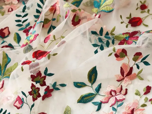
Multi-color embroidery offers greater freedom to represent botanical patterns, abstract artwork, and detailed decorative motifs.
Different thread colors can create visual depth without requiring additional materials.
However, additional colors may introduce more color matching requirements and production considerations.
| Factor | Single-color embroidery | Multi-color embroidery |
|---|---|---|
| Visual character | Subtle and cohesive | Expressive and detailed |
| Color coordination | Usually simpler | Requires careful palette planning |
| Design flexibility | Strong for tonal patterns | Strong for complex motifs |
| Sampling | Focus on thread/base contrast | Review every thread combination |
| Production | Depends on design and stitch count | May involve additional thread changes |
The number of colors alone does not determine manufacturing cost. Stitch count, embroidery area, material selection, machine efficiency, and finishing requirements can be equally important.
How to Develop Custom Colors for Lace and Embroidered Fabrics
A promising color palette is only the beginning of fabric development.
For commercial production, the selected shades must be translated into measurable and repeatable specifications.
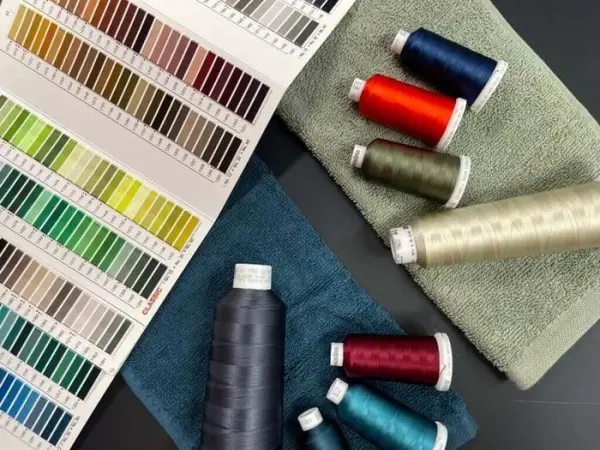
Step 1: Prepare Clear Color References
Brands should provide physical swatches or standardized color references whenever possible.
Digital inspiration images can help communicate a concept, but screen settings and image processing can affect color appearance.
When possible, specify the intended color standard and viewing conditions.
Step 2: Confirm the Base Fabric and Thread Materials
Different fibers and textile constructions may respond differently to dyeing and finishing.
For example, cotton, polyester, nylon, and viscose may require different coloration processes.
The final shade can also be influenced by thread sheen, yarn structure, and fabric texture.
The material should therefore be confirmed before final color approval.
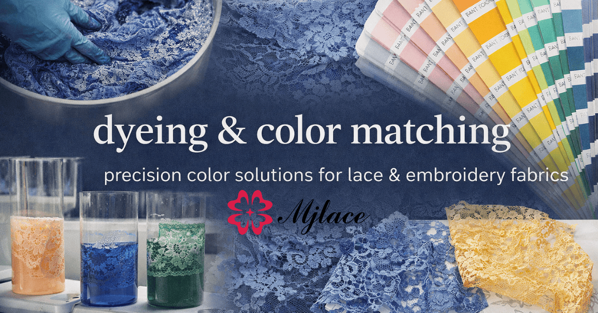
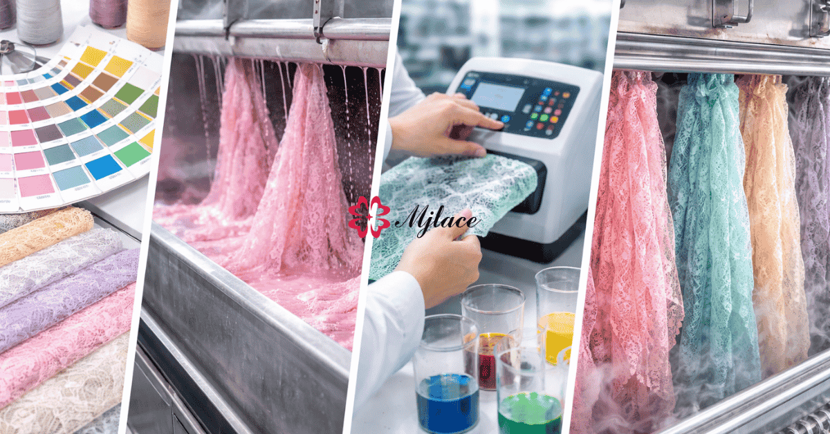
Step 3: Review Lab Dips or Thread Color Samples
Depending on the product and manufacturing process, suppliers may prepare lab dips, dyed fabric samples, or embroidery thread color references.
These samples help narrow the gap between the design concept and production conditions.
However, a thread card or lab dip does not always represent the complete appearance of a finished embroidered fabric.
Step 4: Approve the Finished Fabric Sample
Before bulk production, review the full lace or embroidered fabric sample.
Check the following:
-
Overall color appearance
-
Contrast between base and decorative threads
-
Pattern visibility
-
Surface texture and sheen
-
Color consistency across the sample
-
Compatibility with intended lining or garment materials
Where relevant, evaluate the sample under agreed lighting conditions.
Step 5: Establish Bulk Production Standards
Once the sample is approved, the supplier and buyer should agree on the production color reference and acceptable tolerances.
Color consistency should be reviewed using appropriate inspection methods and agreed quality requirements.
For coordinated garments, it is especially important to consider shade differences between separate fabric components or production batches.
Common Color Development Mistakes to Avoid
Even a carefully selected palette can lead to disappointing results if the fabric development process is incomplete.
Approving Colors Only from Screens
A digital image cannot reliably communicate how a color will appear on a particular fiber, thread, or fabric structure.
Use physical samples for final approval.
Ignoring the Base Fabric Color
Embroidery colors do not exist independently from their background.
A thread shade that appears attractive on white may look significantly different on beige, black, or colored mesh.
Using Too Many Accent Colors
Additional colors can increase visual complexity without necessarily improving the design.
For many garments, a carefully controlled palette can be more effective than a large number of competing shades.
Overlooking Fabric Combination Compatibility
When lace or embroidery is combined with other materials, evaluate differences in dyeing behavior, colorfastness, washing performance, and finishing.
Failing to Define Color Tolerances
Without an agreed reference and acceptance criteria, the buyer and manufacturer may interpret an acceptable shade differently.
Clear specifications help reduce disputes during bulk production.
Working with a Lace and Embroidery Manufacturer on Custom Colors
For fashion brands, custom color development works best when design and manufacturing teams communicate early.
A manufacturer needs more than a color name such as “dusty pink” or “warm ivory.” The development brief should explain the intended material, garment application, artwork, and color reference.
At MJ Lace, custom lace and embroidered fabric projects can be discussed based on customer references, design requirements, and production feasibility.
For new developments, buyers can prepare:
-
Fabric or garment reference images
-
Desired color swatches or standardized color codes
-
Artwork or embroidery pattern references
-
Required fabric width and composition
-
Estimated order quantity
-
Intended garment application
-
Target sampling and delivery schedule
A structured brief helps the manufacturer assess the design and propose an appropriate sampling process.
Frequently Asked Questions
What colors should fashion brands consider for 2027?
Soft neutrals, muted botanical greens, powdered pastels, warm earth tones, deep accent shades, and selective bright colors are useful directions to explore. These are collection-planning recommendations rather than officially confirmed 2027 trend rankings.
Can lace fabric be customized in different colors?
Yes. Many lace fabrics can be developed in different colors, depending on their fiber composition, construction, dyeing method, and production requirements.
Why does the same embroidery thread look different on different fabrics?
The base fabric color, thread sheen, stitch density, surrounding colors, and lighting conditions can all influence the perceived shade.
How can buyers maintain color consistency in bulk production?
Buyers should approve physical color references, establish acceptance criteria, review production samples, and confirm appropriate color inspection procedures with the manufacturer.
Conclusion
For 2027 fashion collections, color offers a practical way to reinterpret lace and embroidered fabrics without relying entirely on new patterns or complicated constructions.
Soft neutrals can highlight texture, botanical shades support natural-looking designs, deep colors create visual impact, and carefully placed bright accents can make embroidery more distinctive.
The most successful color decisions consider both creative direction and manufacturing reality.
By evaluating color combinations, base materials, thread characteristics, sampling, and bulk production standards together, fashion brands can develop decorative fabrics that remain consistent from design concept to finished garment.